Bauhaus / Risograph Modern
Bauhaus risograph modern interface. Ideal for landing pages, saas. AI-ready template.
Use case: Landing pages, SaaS
Historical Context
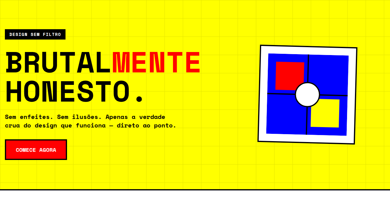
The Bauhaus didn't just teach design — it rewired how we think about visual communication. Founded by Walter Gropius in Weimar in 1919, the school collapsed the boundary between fine art and functional craft. Kandinsky brought spiritual geometry. Klee brought playful systems. Together they built a vocabulary of circles, grids, and primary color that still echoes in every design token we ship today. Form-follows-function wasn't a slogan — it was a survival mechanism. Strip the ornament, reveal the structure. That ethos translated almost perfectly into digital interfaces decades later: clear hierarchy, intentional whitespace, type as architecture. The Bauhaus masters would have loved component libraries. Then risograph entered the conversation. That beautiful, imperfect printing process — with its misregistration, grain, and limited ink palette — gave Bauhaus geometry something it desperately needed: warmth. Suddenly those rigid circles and rectangles breathed. The revival isn't nostalgia. It's correction. Clean structure plus analog texture equals something that feels both rigorous and human. That tension is the whole point.
When to Use
Reach for this when the project demands intellectual credibility without coldness. Art galleries that want to feel contemporary but grounded. Design schools communicating their own values. Creative agencies tired of the same sans-serif minimalism. Cultural institutions bridging historical weight with modern accessibility. It works when your audience appreciates intentionality — when they'll notice the grid, respect the restraint, and feel the texture. Not for brands that need to shout. Perfect for those confident enough to whisper with precision.
Design Principles
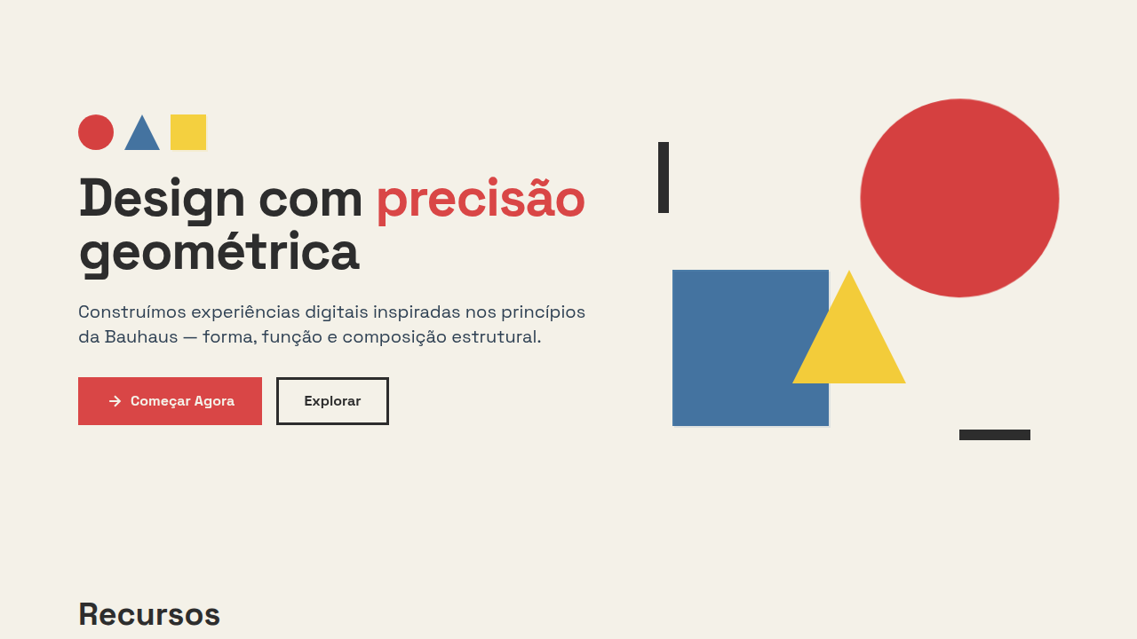
- Geometric primitives as primary compositional elements — circles, triangles, rectangles doing the heavy lifting instead of decoration
- Strict limited palette (3-4 colors max) with deliberate overlap zones where risograph-style ink mixing creates accidental beauty
- Asymmetric balance over centered symmetry — tension holds attention longer than comfort
- Visible texture and grain as a counterweight to geometric precision — perfection is sterile, controlled imperfection is alive
- Typography as structural element, not afterthought — letterforms participate in the composition with the same weight as shape
Technical Specs
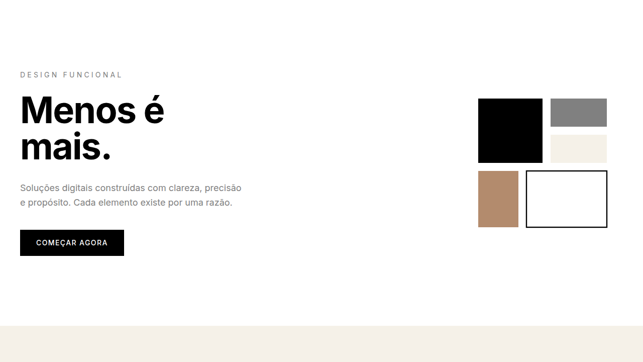
Colors
Primary
Secondary
Effects
Flat graphic lighting, slight misregistration effect, geometric shape animations, grid-based reveals, bold shape transitions
Light/Dark
✓ Full / ✓ Full
Related

Last synced: 4/1/2026