Art Nouveau
Design an Art Nouveau landing page with flowing organic lines and nature-inspired motifs. Ideal for design de pôsteres, capas de livros, branding orgânico e romântico, ilustração editorial. AI-ready template.
Use case: Design de pôsteres, Capas de livros, Branding orgânico e romântico, Ilustração editorial
Historical Context
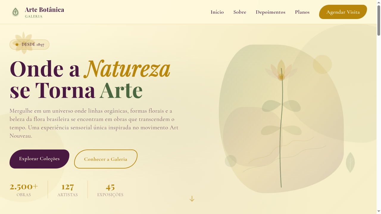
Art Nouveau didn't just decorate surfaces — it fundamentally rejected the machine. Born in the 1890s across Brussels, Paris, and Vienna, the movement was a full-throated rebellion against industrial standardization. Architects like Horta and Guimard bent iron into whiplash curves. Mucha turned commercial posters into sacred geometry. The entire philosophy insisted that art belonged everywhere: door handles, metro entrances, perfume bottles. Nothing was too mundane to deserve beauty. What makes Art Nouveau endure isn't nostalgia — it's the underlying logic. Every curve follows botanical growth patterns. Every ornament serves a structural or compositional purpose. The movement understood something we keep rediscovering: nature's forms aren't decorative afterthoughts, they're engineering solutions. When you trace a Guimard railing or a Tiffany lamp, you're following the same mathematical progressions found in fern fronds and nautilus shells. The movement collapsed by 1910, crushed under its own production costs and the rising appetite for geometric simplicity. But its DNA persists in every brand that chooses organic flow over rigid grids — every time a designer reaches for a tendril instead of a straight line.
When to Use
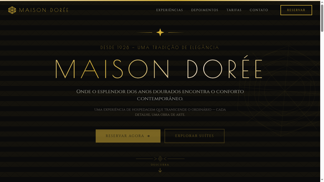
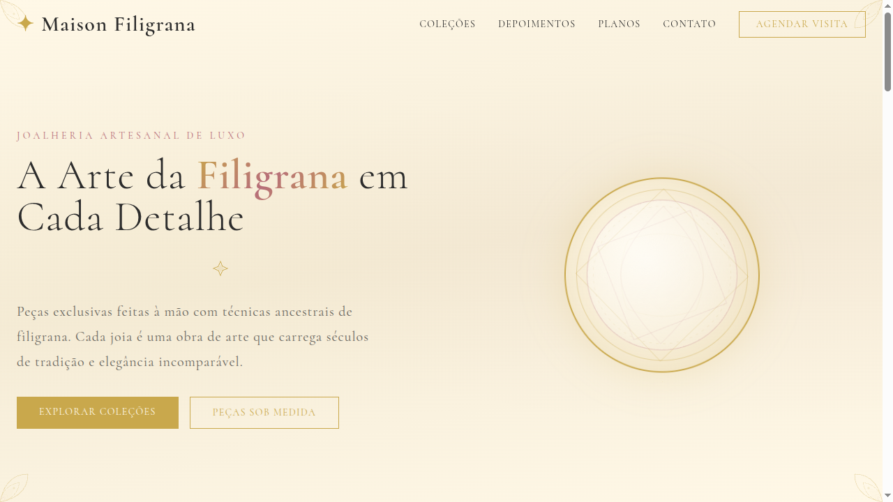
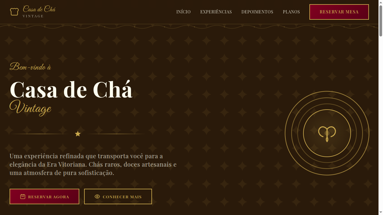
Art Nouveau belongs wherever a brand needs to signal craftsmanship, sensuality, and unhurried luxury. It's the right vocabulary for heritage wine labels, artisanal perfumery, fine jewelry, and cultural institutions that refuse to look like tech startups. Deploy it when your audience values provenance over disruption. Avoid it for anything that needs to feel fast, minimal, or utilitarian — this style demands space to breathe and rewards close inspection. It pairs exceptionally well with rich material textures: foil stamping, letterpress, textured paper stocks.
Design Principles
- Let every line follow organic growth logic — no curve should exist without botanical or structural justification
- Treat negative space as living atmosphere, not empty real estate waiting to be filled
- Unify typography and ornament into a single compositional system — letterforms should feel grown, not set
- Anchor asymmetrical compositions with a dominant vertical flow, allowing secondary elements to cascade naturally
- Restrict your palette to muted, nature-derived tones — let material richness and line quality carry the visual weight
Technical Specs
Colors
Primary
Secondary
Effects
Flowing SVG organic borders (whiplash curves), floral motif corner decorations, nature-inspired section dividers, rounded flowing typography, gentle parallax on botanical elements, warm gradient backgrounds with organic shapes
Light/Dark
✓ Full / ◐ Partial
Related
Last synced: 4/1/2026