Apple Premium Cinematic
Premium Apple-style landing page with binary light/dark section rhythm. Ideal for produtos premium, technology, eletrônicos, marcas de luxo. AI-ready template.
Use case: Produtos premium, Technology, Eletrônicos, Marcas de luxo
Historical Context
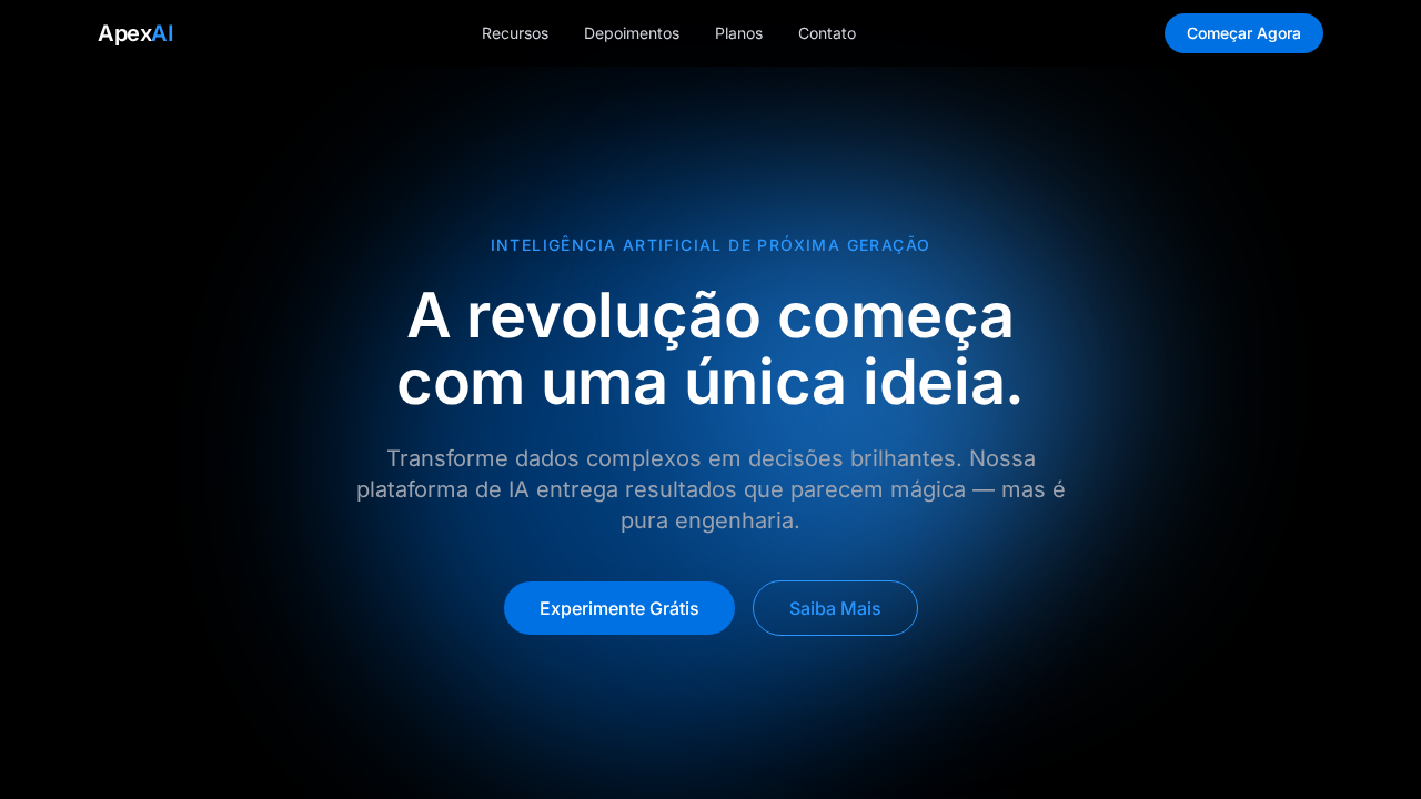
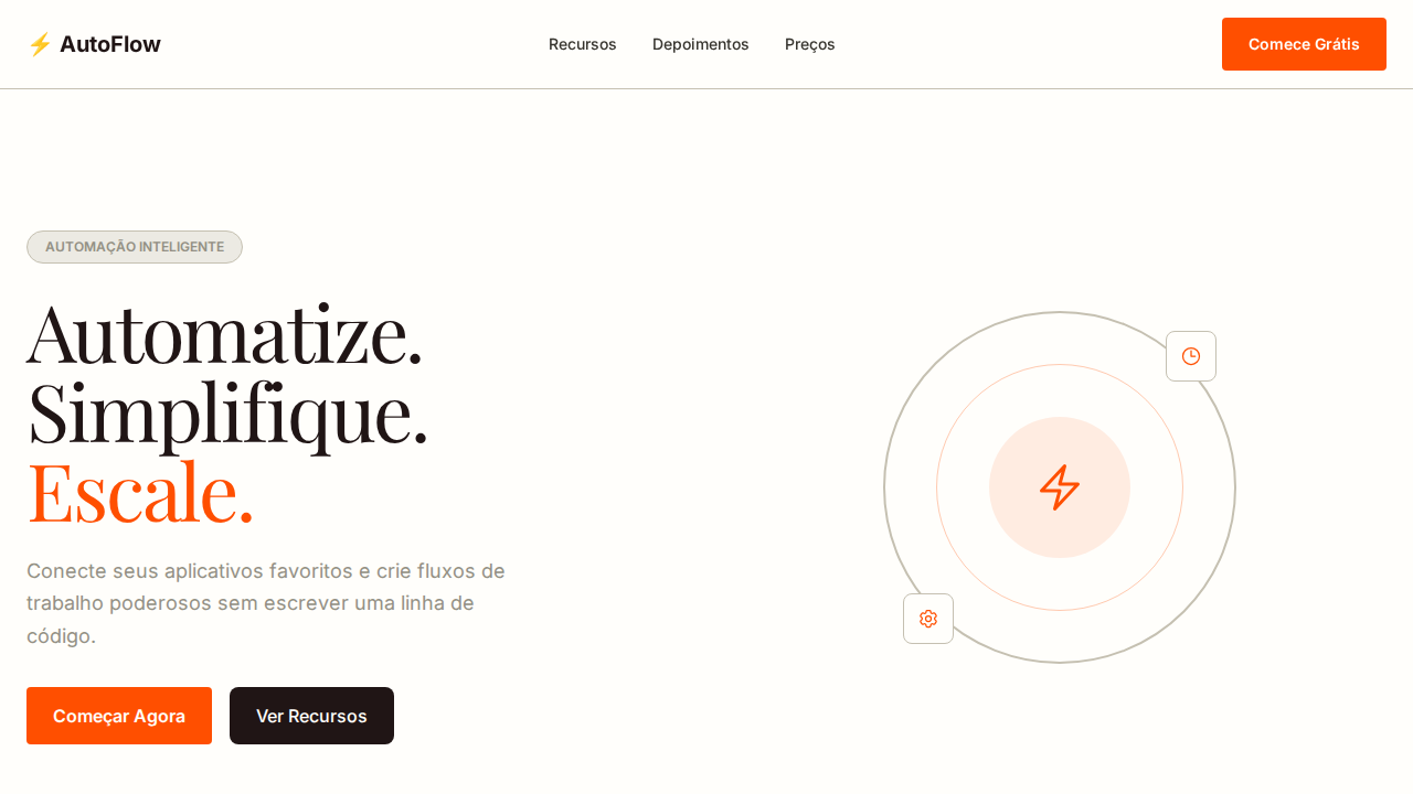
Apple didn't invent dark backgrounds or minimal typography — but they made everyone else look like amateurs trying it. The shift started around 2016 with the iPhone 7 product pages: black canvas, SF Pro in massive weights, and scroll-triggered animations that made a phone feel like a spacecraft. Before this, tech marketing was cluttered — spec sheets, comparison tables, lifestyle photography fighting for attention. Apple stripped it all away and let the product float in void. The cinematic scroll — that parallax-driven reveal where hardware rotates, text fades in at precise moments, and the page itself becomes a choreographed experience — redefined what a product page could be. It wasn't just marketing; it was interaction design applied to storytelling. SF Pro gave them typographic control no other brand had: a typeface designed for screens, optimized at every weight, readable at 200px headlines and 14px body alike. Every premium SaaS landing page you've seen since 2018 owes something to this language. The dark hero, the oversized type, the scroll-driven reveals — it's Apple's aesthetic democratized. Some pull it off. Most don't, because they copy the surface without understanding the restraint underneath.
When to Use
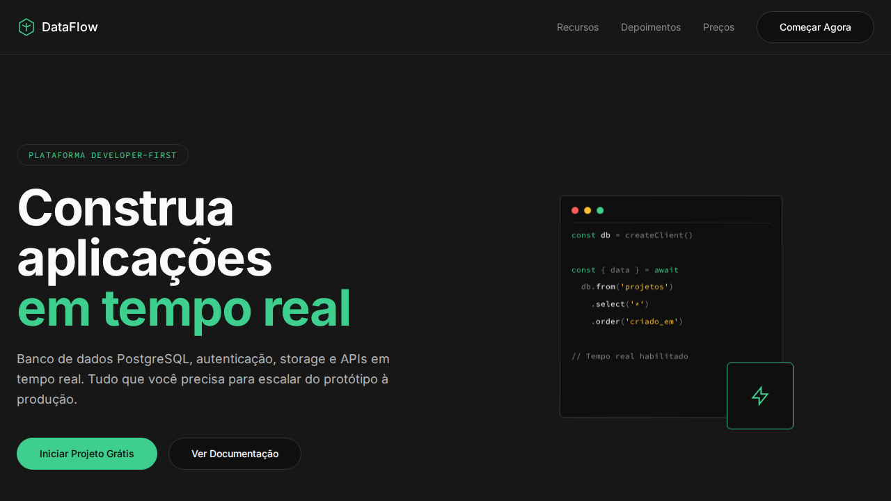
When your product deserves to be presented as an object of desire, not explained with bullet points. Premium hardware, high-end SaaS with visual products, developer tools that want to signal craft, Apple-ecosystem apps that need to feel native to the brand's world. Works when you have strong product visuals — 3D renders, hardware photography, UI screenshots worth showcasing. Falls apart instantly if your product isn't visually compelling or if you lack the engineering budget for smooth scroll animations. This is a high-commitment aesthetic: half-assed execution looks worse than not trying.
Design Principles
- Negative space is the product's stage — every pixel of black background is intentional, giving hardware and UI room to command attention without competing elements
- Typography carries the entire narrative weight — SF Pro or equivalent optical-size fonts at extreme scale contrasts (80px+ headlines against 16px body), no decorative type, no gradients on text
- Scroll is choreography, not decoration — every animation serves revelation timing, hardware rotates to show craftsmanship, text appears when the eye needs context, nothing moves without narrative purpose
- Color is surgical — monochrome dominates, with product color as the only accent; if you add a blue gradient or a purple glow, it better be the actual product finish, not decoration
- Restraint over feature-dumping — one idea per viewport, one product angle per scroll section, trust that less information presented beautifully converts better than comprehensive information presented generically
Technical Specs
Colors
Primary
Secondary
Effects
Seções alternando entre fundo preto puro e cinza claro (#f5f5f7) criando ritmo cinematográfico. Navbar translúcida com backdrop-filter: saturate(180%) blur(20px) sobre rgba(0,0,0,0.8). CTAs pill-shaped com border-radius 980px. Headlines com line-height 1.07 ultra-comprimidas. Produto como herói em campos de cor sólida sem distrações.
Light/Dark
✓ Full / ✓ Full
Related

Last synced: 4/1/2026