Acanthus
Landing page inspired by acanthus leaf patterns from Greek and Roman architecture. Ideal for detalhes arquitetônicos, tipografia sofisticada, layouts de impressão elegantes, museums. AI-ready template.
Use case: Detalhes arquitetônicos, Tipografia sofisticada, Layouts de impressão elegantes, Museums
Historical Context
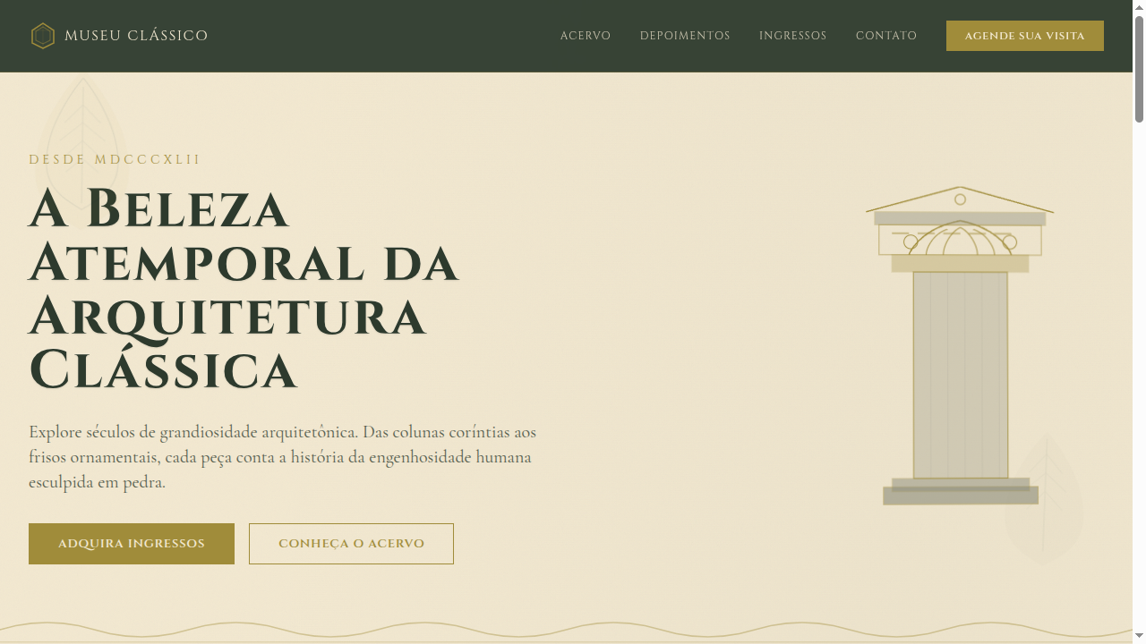
The acanthus leaf is arguably the most consequential decorative motif in Western design history. It first appeared on the Corinthian capital around 450 BCE — legend credits the sculptor Callimachus, who supposedly spotted acanthus leaves growing around a basket on a young girl's grave. Whether apocryphal or not, the story captures something true: this ornament was born from observing nature under emotional circumstances, not from pure geometric abstraction. What makes acanthus remarkable is its survivability across millennia of stylistic upheaval. Roman architects scaled it up for imperial propaganda. Byzantine craftsmen flattened it into mosaic borders. Renaissance designers rediscovered it through Vitruvius and made it central to the vocabulary of humanist architecture. The Baroque stretched and curled it into near-unrecognizable exuberance. Even Art Nouveau — ostensibly a rejection of classicism — owes its whiplash curves to the same organic logic that drives acanthus scrollwork. The motif endures because it solves a fundamental design problem: how to transition between structural geometry and organic beauty. A column is rigid; an acanthus capital softens that rigidity without undermining it. That tension between discipline and flourish is why it still works.
When to Use
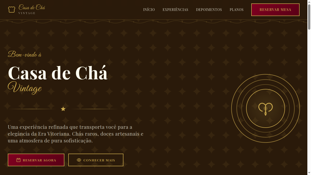
Reach for acanthus when a project demands gravitas without stuffiness. It belongs on heritage brands that need to signal longevity — law firms, auction houses, architectural practices, luxury hospitality. Use it as border detail, capital ornamentation, or repeating frieze pattern. Avoid it in minimalist contexts where it reads as costume. It pairs well with serif typography, muted stone palettes, and generous whitespace. The motif earns its place when the brand genuinely connects to craft, permanence, or classical tradition — never as superficial decoration.
Design Principles
- Maintain the asymmetric naturalism of the leaf — perfectly symmetrical acanthus looks dead and mechanical
- Respect the depth hierarchy: overlapping leaves create shadow and dimension, never flatten them into a single plane
- Scale dictates detail density — large applications can carry deep relief and fine veining; small applications need simplified silhouettes
- Pair with restrained geometry to preserve the structural-organic tension that gives the motif its power
- Leave breathing room — acanthus suffocates when packed edge-to-edge without negative space to frame it
Technical Specs
Colors
Primary
Secondary
Effects
SVG acanthus leaf border ornaments, classical column-inspired section dividers, subtle emboss effect on headings, warm parchment texture backgrounds, gentle parallax on decorative elements, smooth transitions (350ms)
Light/Dark
✓ Full / ◐ Partial
Related
Last synced: 4/1/2026