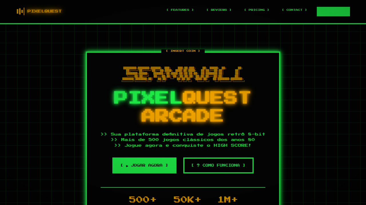
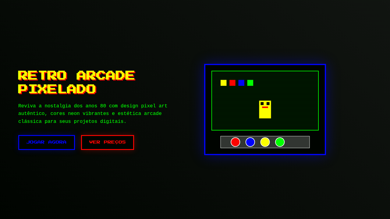
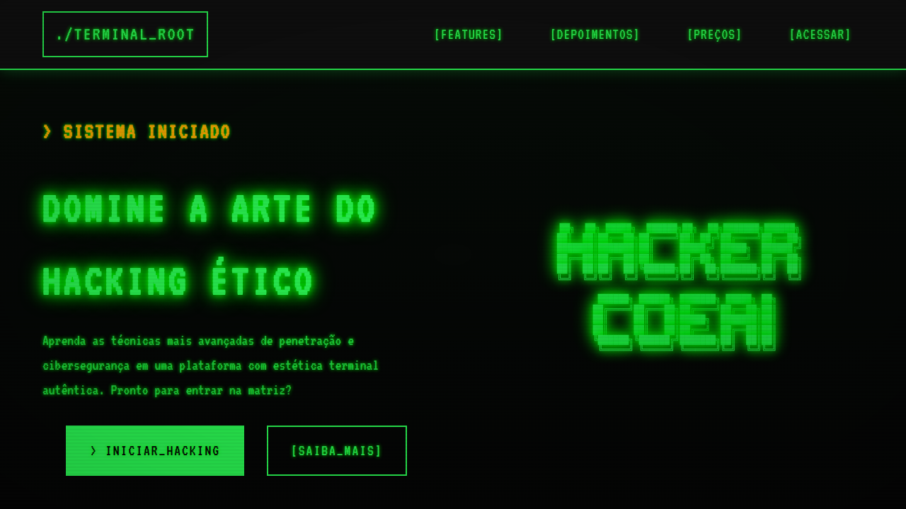
8-Bit Retro Terminal
8-bit landing page, retro terminal style, pixel art, green phosphor text, scanlines, arcade game aesthetic. Ideal for landing pages, modern websites. AI-ready template.
Use case: Landing pages, Modern websites
Historical Context
Before screens could render curves, before anti-aliasing existed as a concept, every character lived on a grid. The Commodore 64 gave you 40 columns and 25 rows. DOS handed you green phosphor on black. The early Macintosh — despite its GUI ambitions — still rendered Chicago in bitmaps, every letter a tiny sculpture of on/off pixels. These weren't aesthetic choices. They were physics. CRT electron guns, limited VRAM, 8-bit address buses that could only think in powers of two. Designers worked within brutal constraints: monospaced type because proportional spacing cost too many cycles, blocky cursors because sub-pixel rendering was decades away, scan lines because that's literally how the beam drew. Then something happened. The constraints disappeared but the look didn't. Somewhere in the late 2000s, indie developers and digital artists started reaching back — not out of laziness, but recognition. Those limitations had produced something genuinely beautiful. The grid wasn't a cage. It was a composition tool. The low resolution forced clarity. Every pixel earned its place.
When to Use
When you want immediate nostalgia without explanation. Retro game interfaces, developer tools that wear their nerdiness proudly, indie titles that signal craft over budget. Works brilliantly for CLI-inspired SaaS dashboards, hacker-themed products, or anything targeting people who remember — or romanticize — the days when computers felt like magic boxes rather than appliances. Avoid if your audience skews toward luxury or corporate polish.
Design Principles
- Honor the grid absolutely — every element snaps to pixel boundaries, no sub-pixel rendering, no fractional positioning
- Monospace is non-negotiable — proportional fonts break the illusion instantly, choose faces like IBM Plex Mono, Berkeley Mono, or press-start-2p for display
- Color palettes stay small and saturated — pull from real hardware (C64's 16 colors, CGA's cyan-magenta-white, Game Boy's four greens) rather than inventing arbitrary retro-ish schemes
- Animation happens in discrete steps — no easing curves, no smooth transitions, movement jumps frame-to-frame like sprite animation on hardware that couldn't interpolate
- Embrace the cursor as interaction metaphor — blinking block cursors, text-based feedback, command-line patterns for navigation signal authenticity over decoration
Technical Specs
Colors
Primary
Secondary
Effects
ASCII art, pixel-art iconography, binary strings, bracket-style terminal frames, CRT monitor phosphor glow, scanlines.
Light/Dark
✗ No / ✓ Full
Related

Last synced: 4/1/2026