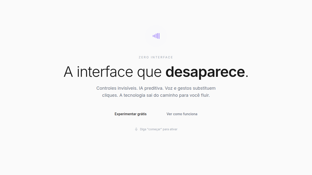
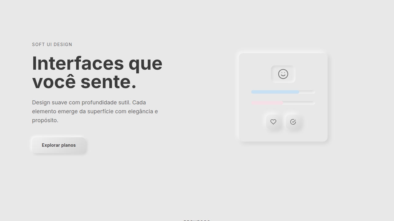
Zero Interface
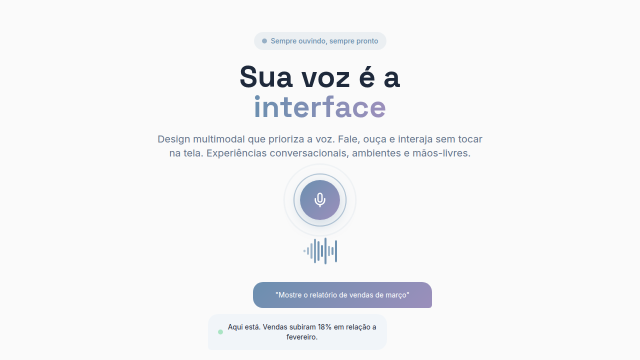
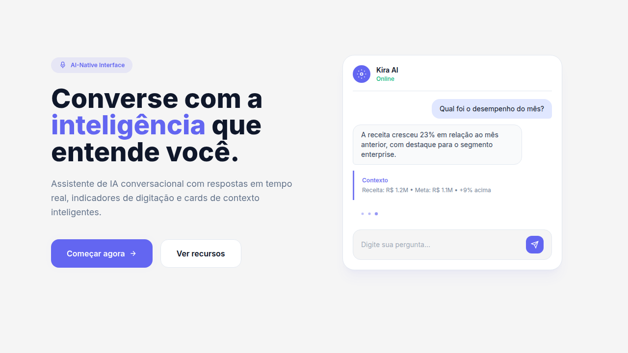
Voice-first, gesture-based, AI-driven interface with minimal visible UI, progressive disclosure, voice recognition UI, gesture detection, AI predictions, smart suggestions, context-aware actions. Ideal for landing pages, saas. AI-ready template.
Use case: Landing pages, SaaS
Historical Context
Golden Krishna's 'The Best Interface Is No Interface' landed in 2015 and felt radical. The argument was simple: we'd become so obsessed with screens that we forgot most problems don't need one. A car should unlock when you walk up to it. A prescription should refill itself. The screen is the bottleneck, not the solution. Designers mostly nodded and kept making screens anyway. Then AI assistants actually got good. Siri was a joke, but the trajectory from AirPods tap-to-talk to Apple Watch complications to Vision Pro's eye tracking tells a clear story — each generation removes a layer of visible interface. Ambient computing isn't a buzzword anymore; it's the thermostat adjusting before you feel cold, the speaker answering before you find your phone. Here's the paradox that keeps zero UI designers employed: invisible interfaces still need systems. You need consistent voice patterns, haptic vocabularies, transition behaviors for contextual surfaces that appear and vanish. The design system doesn't disappear — it just stops being about pixels.
When to Use
Zero UI is genuine when the task is simpler than the interface required to control it. Unlocking a door, skipping a track, setting a timer — these don't need screens. But be honest with yourself: if your 'zero UI' solution requires users to memorize twelve voice commands or learn a gesture alphabet, you've just moved complexity from visible to invisible. That's worse. The real test: can a first-time user accomplish the task without instructions? If not, you need at least a minimal fallback surface. Zero UI works best as a layer on top of traditional interfaces, not a replacement.
Design Principles
- Context is the interface — surface controls only when environment, time, or user state demands them, then dissolve immediately
- Design the fallback first — every zero-UI interaction needs a visible escape hatch for when voice fails, gestures misfire, or AI guesses wrong
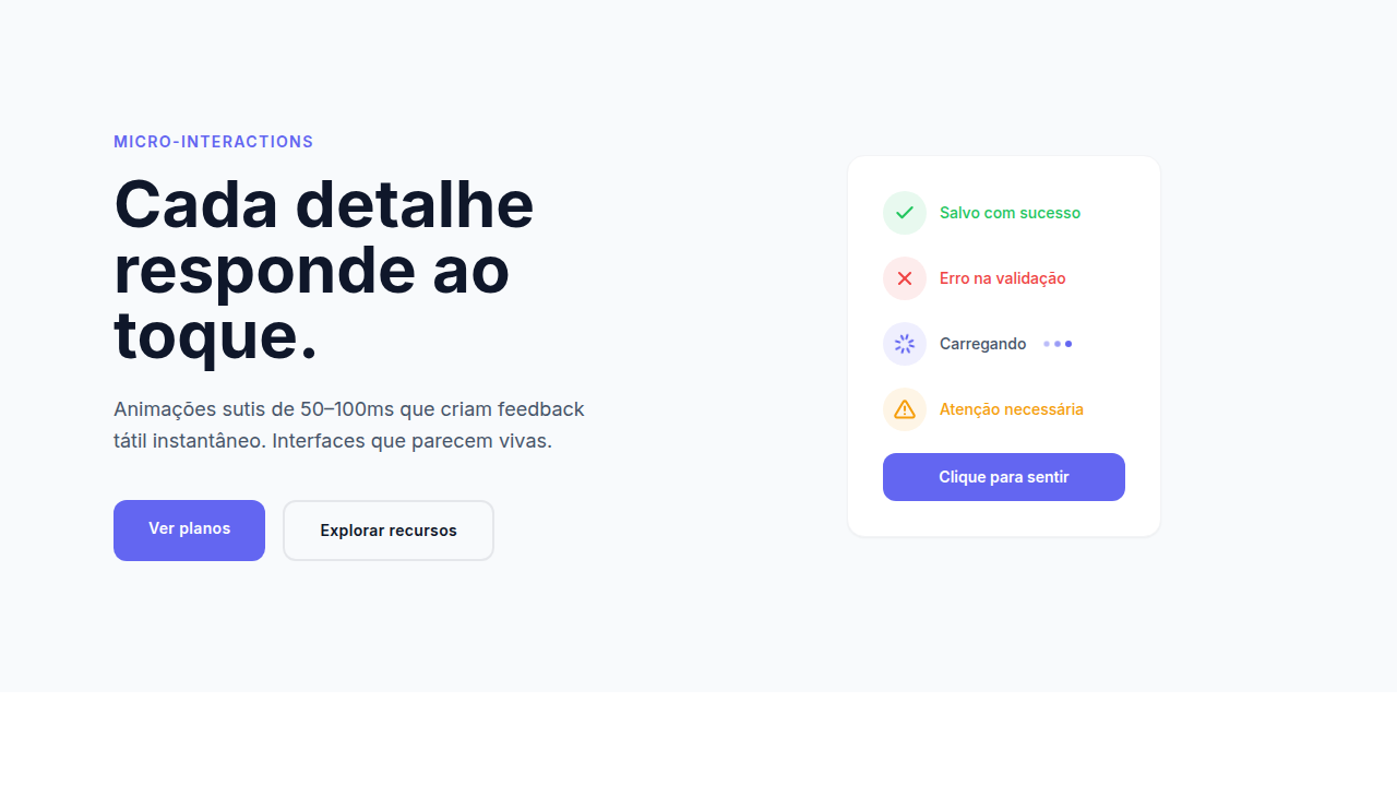
- Haptic and audio as primary feedback — without pixels, confirmation must come through vibration patterns, spatial audio cues, and tonal language
- Progressive disclosure through modality — start with the lightest interaction (ambient awareness), escalate to voice, then gesture, then screen only as complexity requires
- Consistent invisible grammar — voice command structures, gesture vocabularies, and contextual triggers must follow repeatable patterns even without visual reinforcement
Technical Specs
Colors
Primary
Effects
Voice recognition UI, gesture detection, AI predictions (smooth reveal), progressive disclosure, smart suggestions
Light/Dark
✓ Full / ✓ Full
Related

Last synced: 4/1/2026